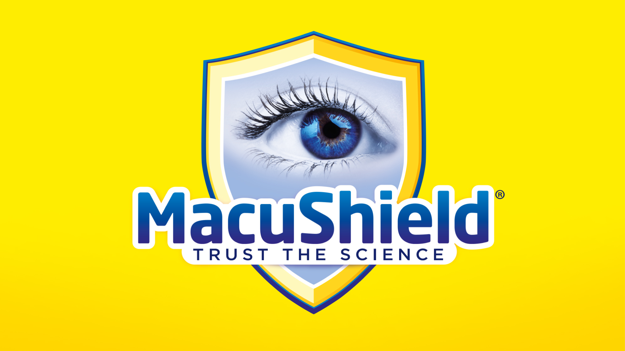
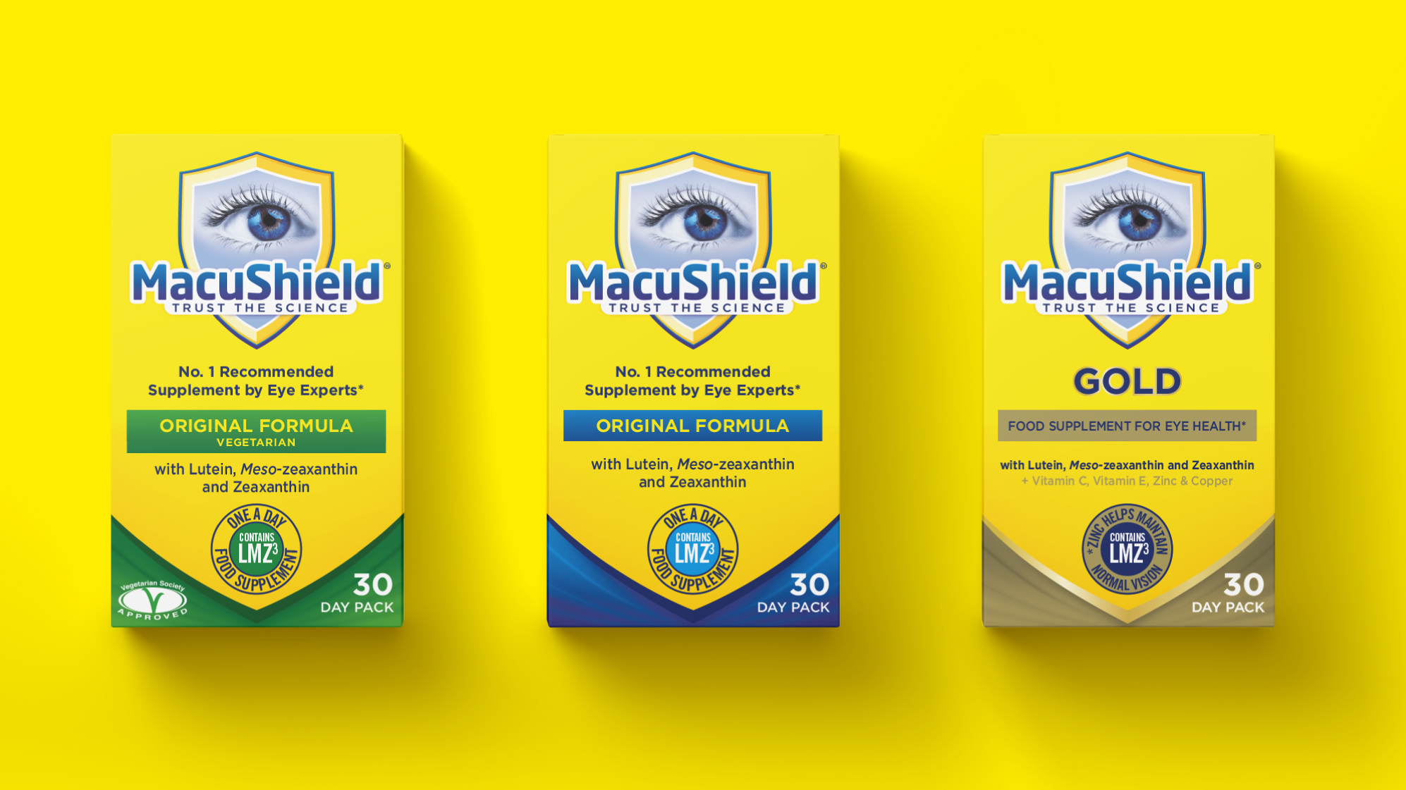
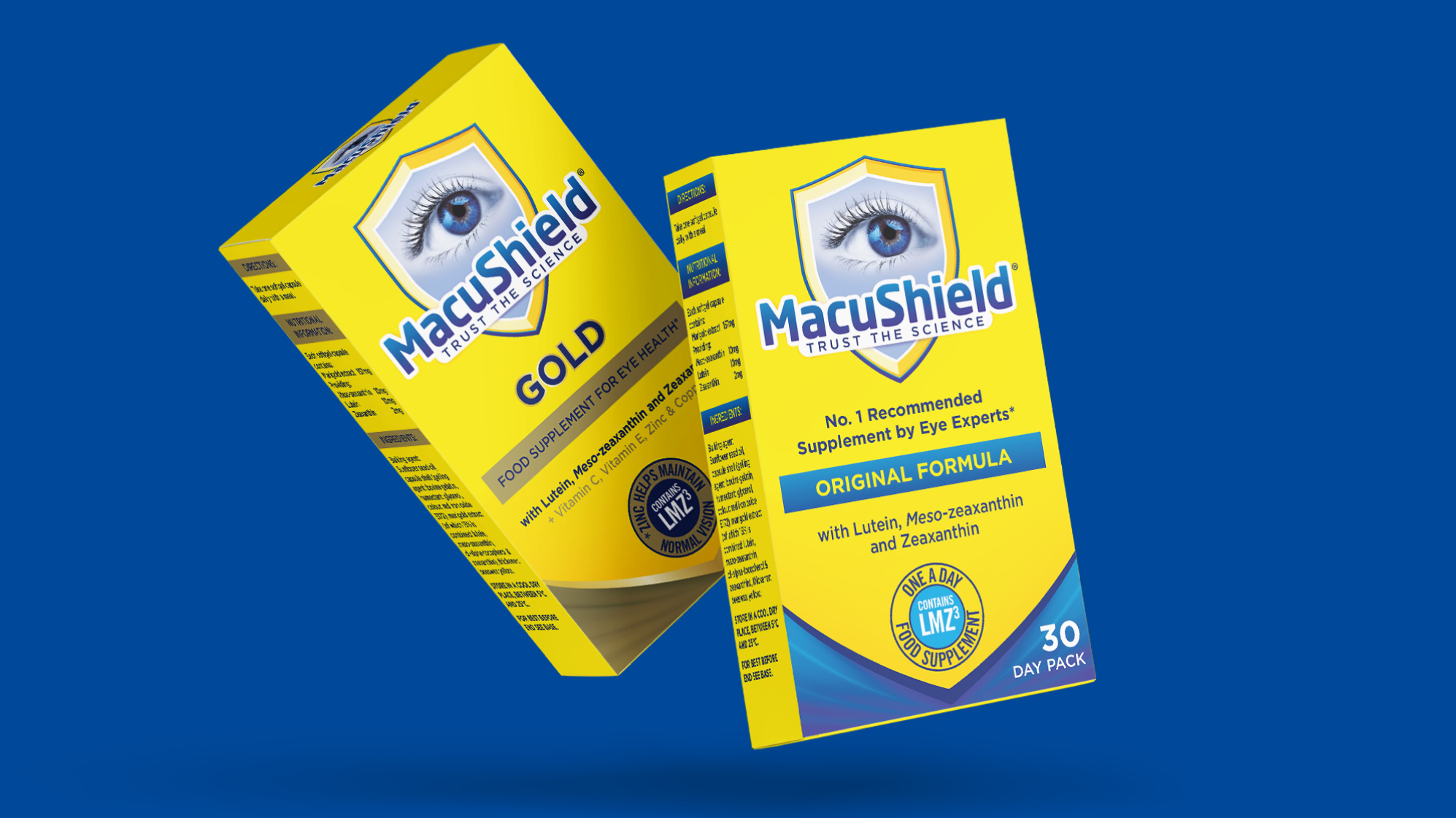
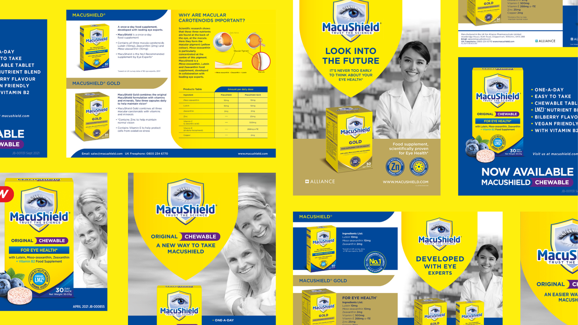
MACUSHIELD
The refresh of MacuShield needed to retain visual elements and the blue and yellow colours for instant brand recognition, whilst giving the brand a more modern and contemporary feel. We reworked the eye, shield and logo – locking up the Trust the Science tag line into the logo. We then cleaned up the pack, and created the secondary shield device at the bottom on the pack to further aid shelf standout and key message navigation.
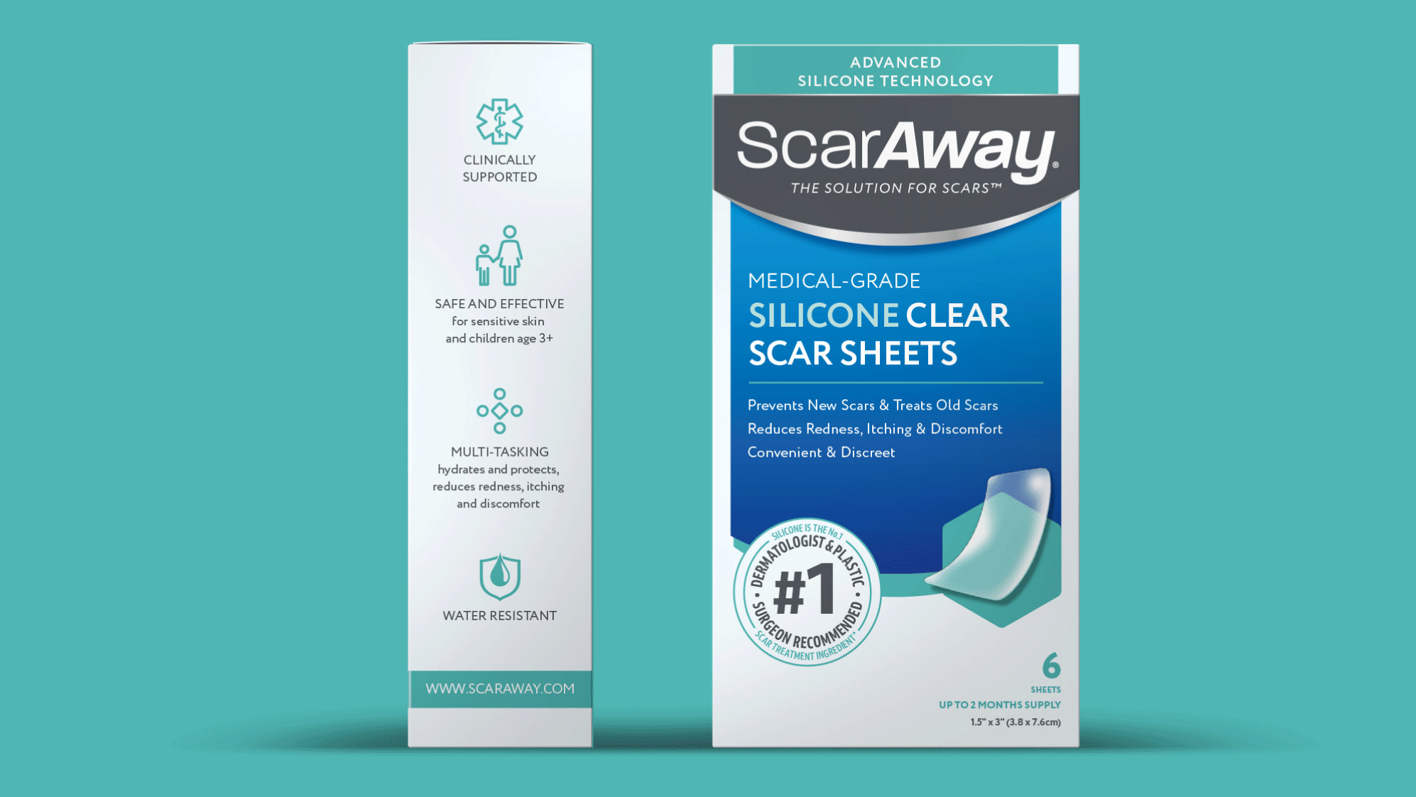
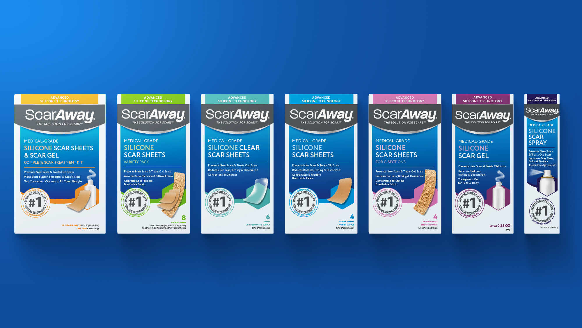
SCARAWAY
USA brand ScarAway lacked shelf stand out or any brand blocking in a very busy fixture. Our redesign emphasised the strong logo by a subtle redrawing to retain synergy with the previous logo – but enabling it to pop out on shelf together with its strong new colourways and accent colours. Clever roundels and clear iconography further helped pack navigation and clear messaging.
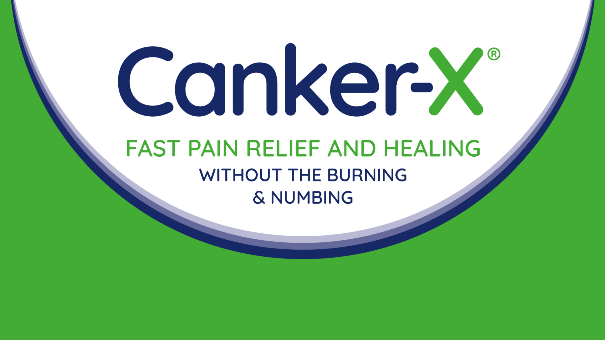
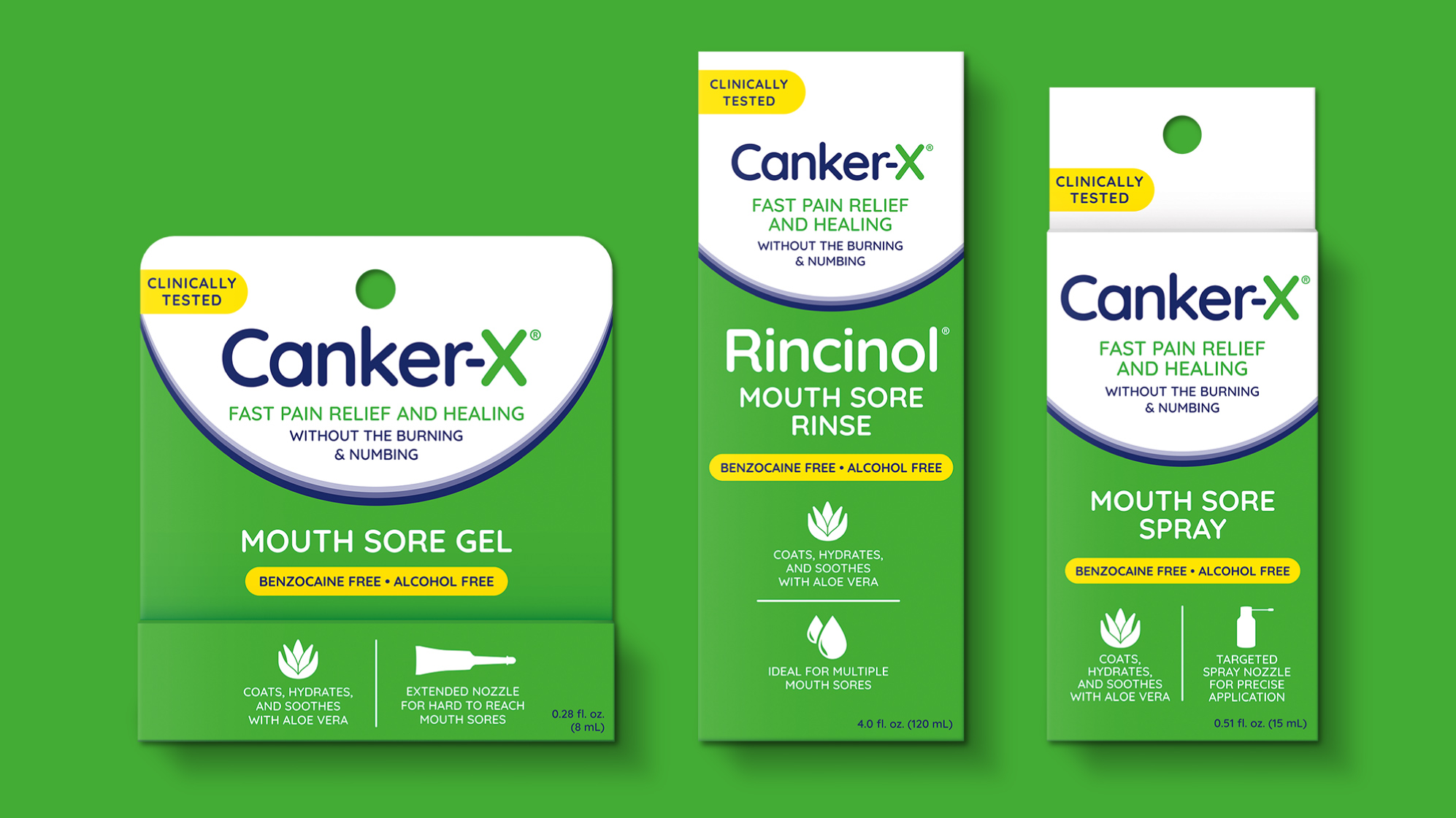
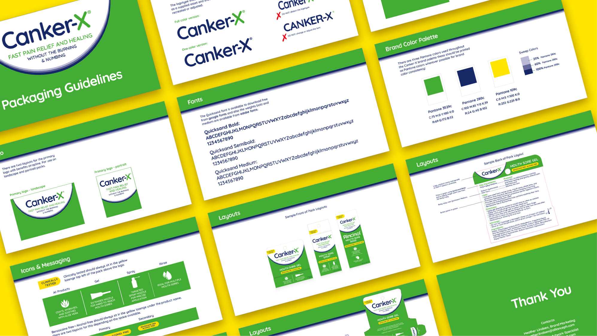
CANKER-X
USA brand Canker X was created due to a distributor change – and the only direction we needed to follow was to keep the green and white of the previous brand name. It’s a rare and fabulous brief to get! The white curve creates instant synergy amongst the different pack formats, with the yellow lozenge clearly calling out key medicinal messages. Included in the white sphere are the priority messages of brand name and reason to believe. Clear iconography further cleans up the packs.
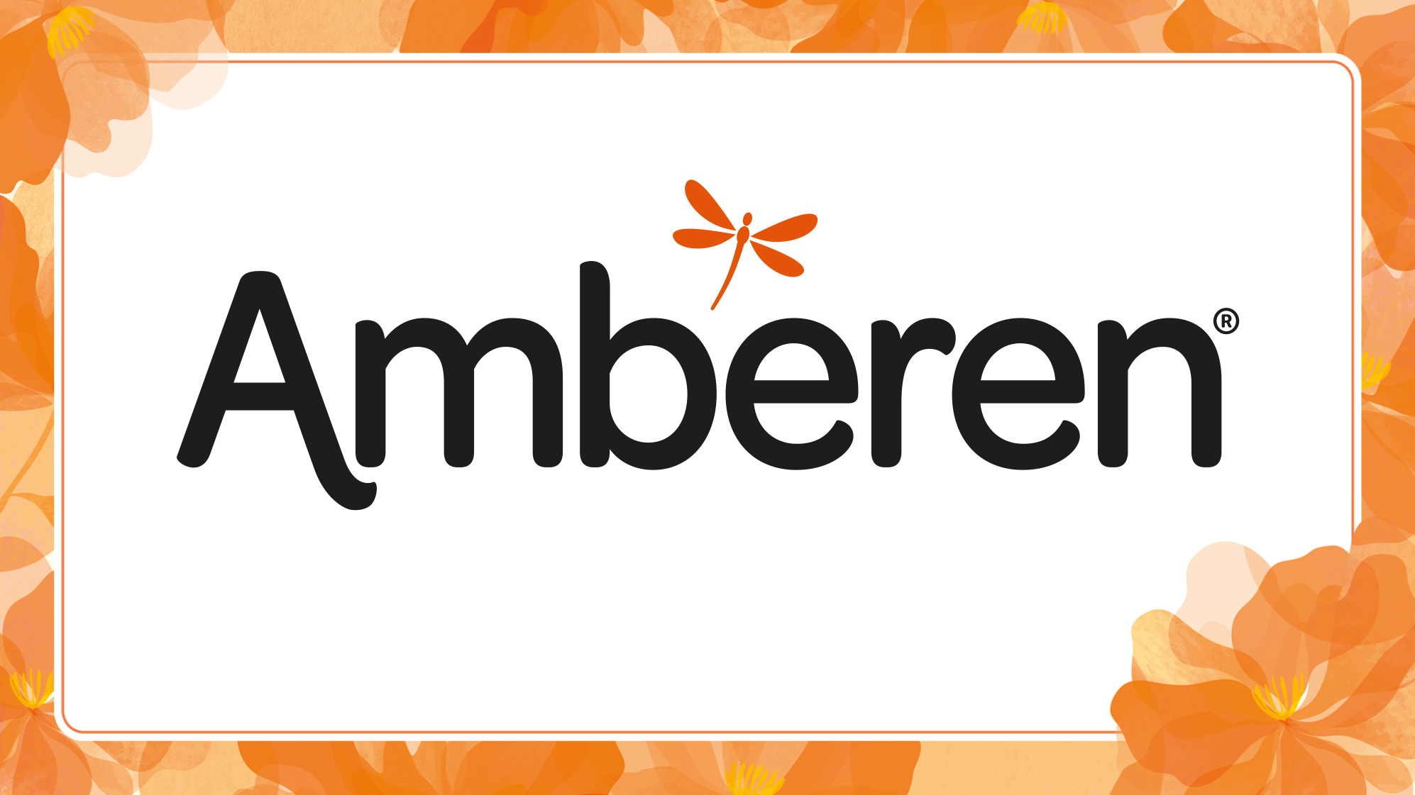
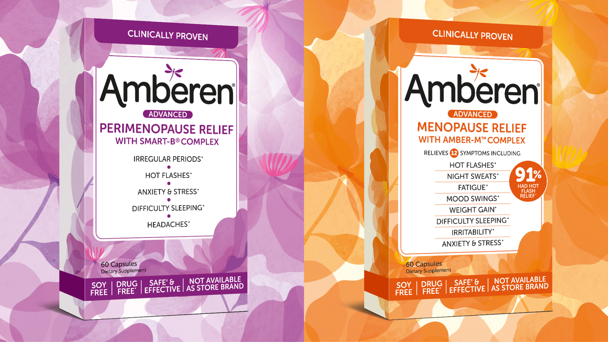
AMBEREN MENOPAUSE RELIEF
In the USA market a sea of menopause relief brands look like they have been designed by clinicians for clinicians – we wanted to retain Amberen’s feminine feel as a pack designed by women for women – it felt like it was part of the brands DNA and brand personality. But we wanted to give the pack a strong identity, clear messaging, and a powerful shelf standout which this new brand livery meets the challenge perfectly.
SEE SOME MORE...